CSS: Fixed-Layout vs Flowed-Layout
Many websites, when you increase the font size, part of the text went off window. It forces you to enlarge the window or do horizontal scroll.
Even now as of 2026-01-01, people still doing it. Idiots.
If you gonna do that, goto PDF.
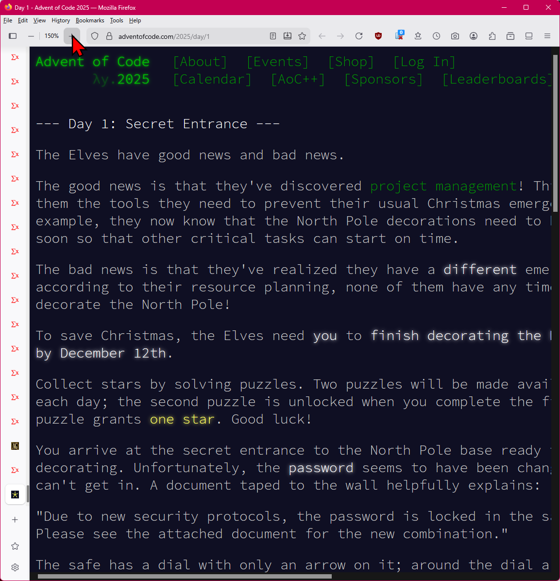
Example. Year 2025, Website “Advent of Code”.
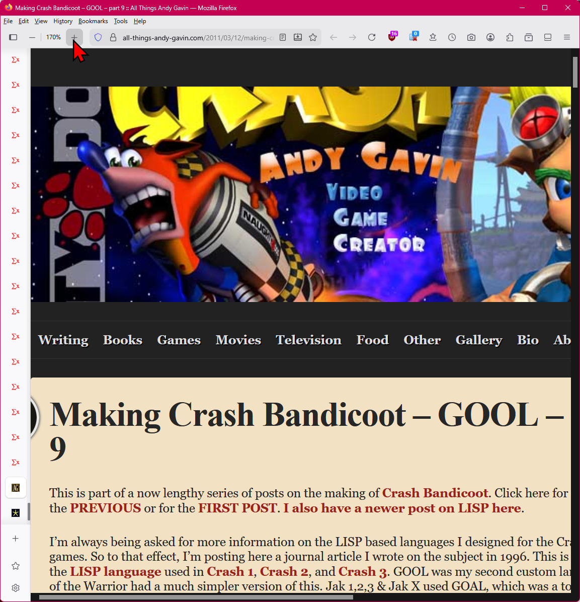
Example. Year 2011, Website “Crash Bandicoot blog”.
here's a example, of a web page in 2011.
Example. Year 2010, Website “A List Apart”.
- alistapart, with Fixed-Layout design. When windows width is smaller, contents are cut off.
- This often happens when you increase font size when text are too small.
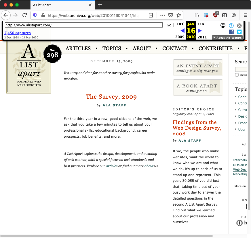
alistapart is a popular web design blog.
(note: alistapart site changed as of 2013-03-17 so now it is flowed.)
another example:
- Compare JavaScript frameworks
- By Joe Lennon.
http://www.ibm.com/developerworks/web/library/wa-jsframeworks/?ca=dgr-dwexnbarbw
The biggest transgressor of this, is apple.com. However, Apple.com is quite well designed, and i never had to enlarge font.
Flowed-Layout vs Fixed-Layout
In web design, there's flowed layout vs fixed-layout design. Both have advantages.
Fixed-layout is especially important for print media, such as newspaper, magazine, books. These, you need efficient use of space, and no large gaps between columns. That usually requires you to have tight control down to pixels of every element.
But as digital documents, fixed-layout is not suitable because you need your document to be displayed on screens of various size, from palm sized devices to huge cinema screens. And with screens, you have the concept of scroll instead of fixed pages. There isn't a worry of white gaps as in printed media, in fact gaps make the doc's structure more clear, and you have links, buttons, etc that can do pop-ups, frames, tabs, and windows can be positioned side by side or re-sized, moved, which gives user much better control in reading the document. So, flowed makes much more sense.
Zoomer Responsive Design
- Flowed-layout is not your idiotic notion of “Responsive Design”.
- “Responsive Design” is a zoomer jargon, came around when CSS Media Query came about in 2012, due to the popularity of smart phone with tiny screens, vs presumed minimum of 1024 pixels width (at the time) personal computer screens.
- “Responsive Design” is a CSS technique, for detecting screen size and adjust element width automatically.
- You can use “Responsive Design” to design a fixed-layout page, for huge screen or tiny phone screen.
Flowed layout vs fixed layout, is a eternal web design contention.
- Flowed layout vs fixed layout, is a eternal web design contention.
- It spring into existance in late 90s.
- Printed world is all about fixed layout.
- Flow-layout does not exist, until computer screen came about.
- HTML came around 1990. It was created to be flowed layout, the thinking was “semantic markup”. E.g. Title, chapter, section, subsection, paragraph, list.
- Scientists, nerds, coders, like semantic markup and flowed layout.
- But web designers, as a creature that was born later, prefer fixed layout, as in printed newspapers and magazines.
- It was a huge fight, between the fixed-layout vs flowed-layout, appearance vs structure, for decades, affecting much of the evolution of HTML and CSS.
- The contention is not settled, even today in 2026.
- Because fixed-layout are preferred by typically commercial orgs (e.g. Apple, amazon, etc), they want layout to be predicable in fixed positions like in printed paper. There is a sense of DESIGN.
- But flowed layout, really works well when screen size is unpredictable or the windows size.
- Today, usually it is a mix of both. Flow overal for many screen sizes, but fixed in parts.