User Interface Design Criterions
Here's some of the critical elements in user interface design.
- The front window must be visually distinct from others. For example, have different color in title bar, or have colored border, or shadow.
- UI elements must be clear that they are active clickable elements.
- Radio buttons must be clear of its on/off state.
- Checkboxes must be clear of its on/off state.
- buttons must be clear if it is default action when pressing enter. For example: a dialog with cancel and appy buttons.
Bad Flat User Interface Design
These User Interfaces fails basic usability.
- Difficult to tell which window is in front.
- Difficult to tell which tab is current.
- Difficult to tell which is button, which is not a button.
- Difficult to tell button's on/off status.
Flat Design of Original X Window System, Bad
This is bad, but excusable, because back in 1980s, computer resources are limited. You can't draw 3D widgets or shadows.
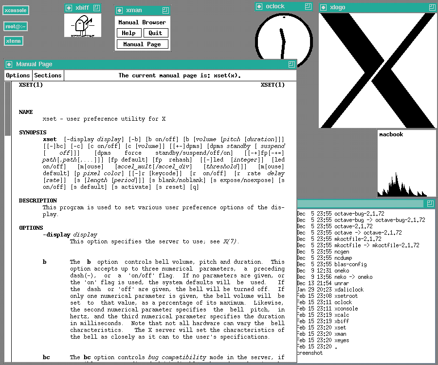
Grey Slab Design of Classic X11, Not Very Good
In 1990s, unix X11 (including Linux) sports a grey slab style. This is better than flat, but still hard to discern the various states of buttons or boxes.
Microsoft Windows Metro Sucks
 Metro Flat Design Sucks
Great User Interface Design
- Easy to tell which window is in front.
- Easy to tell which tab is current.
- Easy to tell which is clickable button.
- Easy to tell button's on/off status.
- Easy to tell radio button on/off status.
- Easy to tell radio button on/off status.
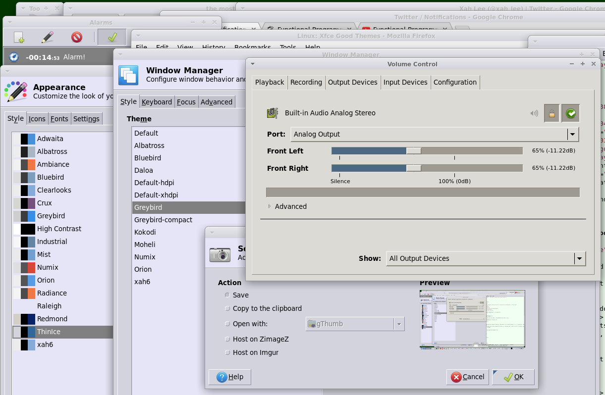
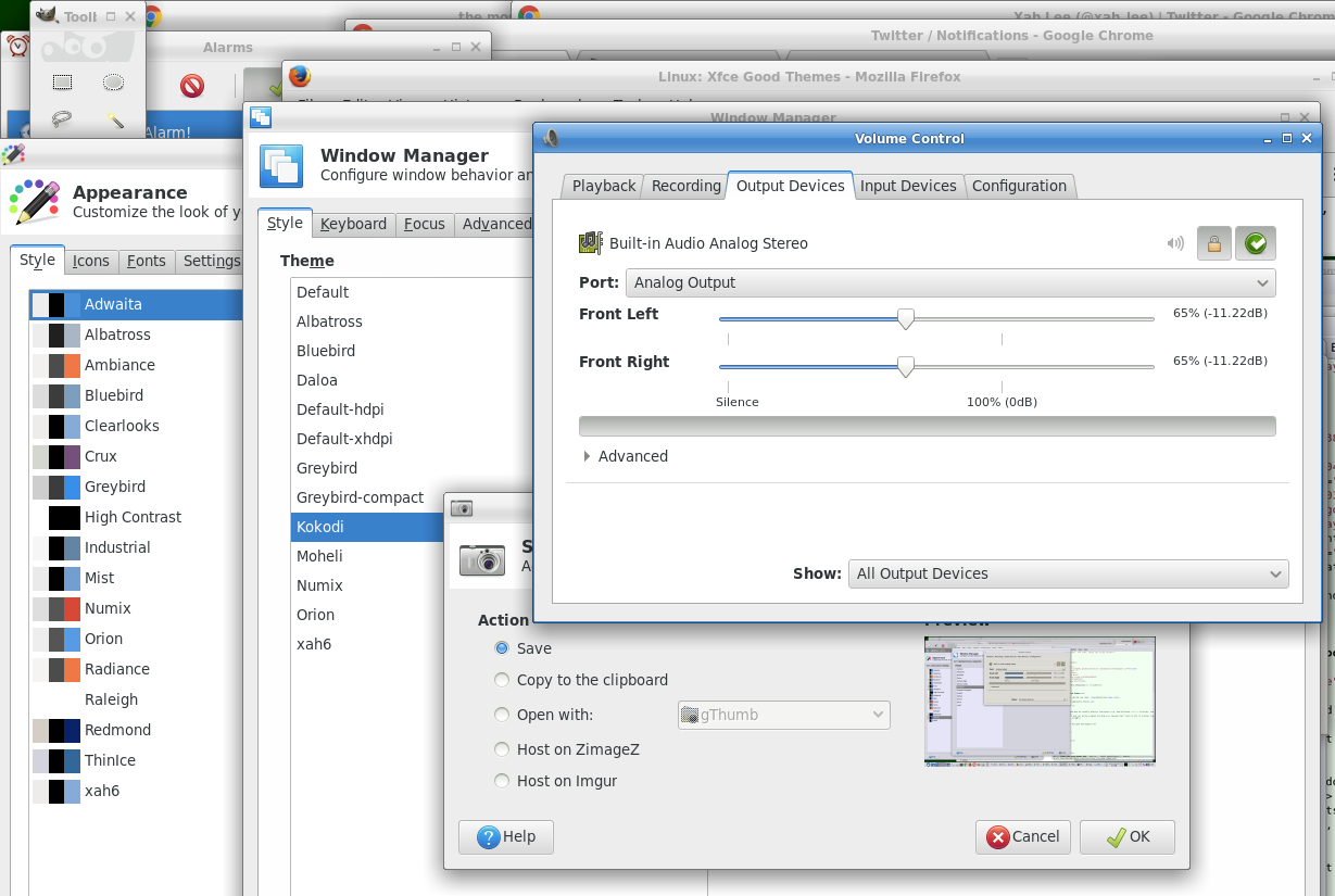
Linux Xfce Good Theme Choices
appearance that has good GUI widgets:
- adwaita
- albatross
- ambiance
- bluebird
- greybird
- high contrast
- numix
- orion
- radiance
bad x11 slabs:
- clearlooks
- crux
- industrial
- raleigh
- redmond
- thinice
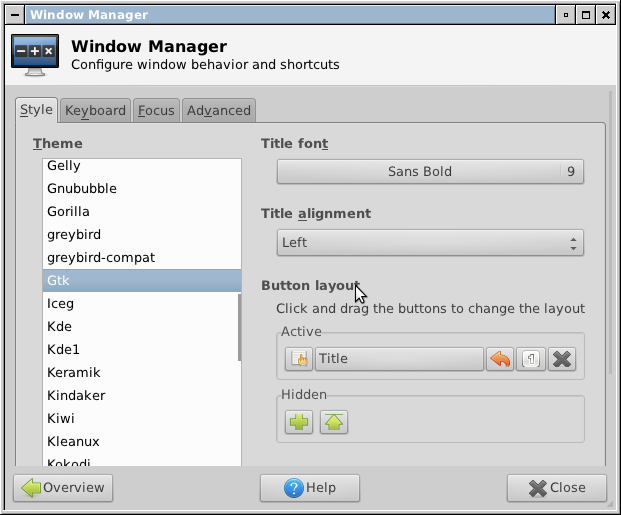
Window Manager theme that has easily distiungished front window title bar:
- daloa
- abatross
- kokodi
- moheli