Why Windows User Interface Suck
What the fuck. Settings and control panel like a criple twin. Ease of access repeated, each are actually different and after a few clicks the pretty one goes to its ugly big brother. Similar for other setting apps. And Microsoft made sure there are a hundred way to get into one place like a spider web. Many app still ugly bitmapped images.
Truly amazing, windows has all these petty problems, 30 years, still the same. For example, when the comp sleeps, and i also sleep, then in mid of night, the comp starts up, fans blowing, it's like what the fuck, someone network hacked my comp? Like who the faak would create a system like that. While such problem never happens on Mac?
Then u look at windows's settings or options, it's pretty incomprehensible. You tweak this knob and that switch for hours and days just to see what is its effect. And amazing, such problem just don't happen on the mac, for 30 years. Design, is the word.
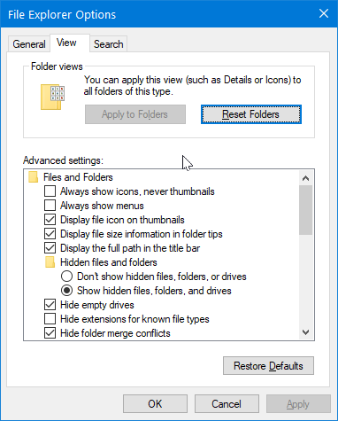
And comes windows 8 or 10, with cleancut boys on stage them design gurus telling u about how they designed metro sparkling. Then, i start to use windows, realize faaaking half of the windows settings UI is still from 90s with tiny unresizable window. Amazing. Amazing incredible faak. Truely.

It's not like a oversight. But blatant half of the setting apps are from 1990s user interface untouched. WHO, the faak pretty face boys on stage yabbling about how beautiful is windows new UI design while half of its setting UI is still from 90s?
So, a person ran into this situation, it's natural to ask, why how possibly did this happen? And, i've thought about this fairly a bit over the years, and i think i know the reason. They don't care. It's not cuz Microsoft lacks smart designers or brain. Tons of great engineers and designers and coders exist, at Microsoft. But for multiple reasons, they are roughly:
- Microsoft as a corp don't care, because they are dominant OS. Fixing up the lousy UI details won't get them more users.
- But why they have pretty boys demo on stage expo and show and mouthing about how shiny is Metro? Answer: that's just for marketing.
- Then, another reason is, Microsoft is a big corp, just like Google is today, diff departments in the company r not exactly friends. Each only care about themselfs, not the whole company. So, inconsistency of Windows is other department's problem.