Software Skin Cancer
“a fish, a barrel, and a smoking gun”
for 10 April 2000. Updated every WEEKDAY.
Skin Cancer

Pity the poor slob who just wants to get something done. Set adrift in a sea of functionality he can neither comprehend nor control — buried in toolbars, insulted by assistants — he can only look at the state of the average application's user interface and think that things can't possibly get any worse.
Inevitably, he's wrong. Long relegated to the back seat of the software development process in favor of ever-more useless features, usability has recently been chloroformed, hog-tied and stuffed in the trunk. Exhibit A: the newly prereleased Netscape 6. The tyranny of the skins has begun.
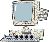
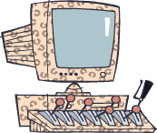
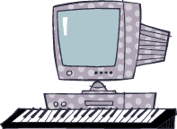
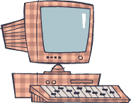
“Skins” are a recent product of the hyper-democratization of code. The computer equivalent of back-ally chin tucks, skins allow a growing number of applications to change their looks in a growing number of ways, almost all of them bad. In a scenario that undoubtedly leaves DeTocqueville twitching uncomfortably in his grave, an unthinking Jolt- and marketing-fueled push towards visual freedom — is leaving 15 years of common-sense progress in user-interface design bleeding in a ditch. You may recall that even Suck was dragged into the skin game about a year ago, and the scars on our own skins still haven't healed.

Though extreme software customization can be traced back to usability nightmares like desktop themes and X window managers — What should happen when you right-click? When you center-click? When you left-click? When you Shift-right-click? When you ... — application-specific skins are a fairly new development, especially for the Windows-based mainstream. Can't stand to choose between the equally alluring sirens of ICQ and Dragonball Z? No problem. If you're willing to ignore the fact that the software becomes unusable because you can't see anything, then a few clicks of the mouse will set you right up.
In a more aesthically advanced republic, most people wouldn't be allowed to decorate their own homes, much less design their own user interfaces. But who are we to judge if someone's got a thing for nubile teens? Unless, of course, the desire to serve that fetish starts to interfere with our ability to use the damned software. In a move that will leave future generations either snorting in disgust or doubled-over with laughter, Netscape 6 actually requires the skins, completely ignoring the look-and-feel of the operating system it's running on. For Netscape 6 users, skins have become more than amusing little graphical diversions: They've become the death of the standard interface. We have seen the future, and it is damned hard to use.

The open-source Mozilla Project — of which Netscape 6 is a variant — goes so far as to include XUL, an entire user-interface language, in its bag of tricks. If simple visual skins are the moral equivalent of a tan and a dye job, XUL-based “chrome” is major reconstructive surgery. In what is admittedly an impressive technical feat, the look, position, and even the functionality of the program's controls are all subject to random whim. Mozilla skins will even be instantly downloadable via the Web. And you thought popup ads were annoying.
On one level, such customizability makes a lot of sense. The browser functionality of Mozilla will be used in all sorts of devices, from cell phones to, um, cell phones, and the smooth ability to customize the entire interface will no doubt come in handy.
But on another level, Mozilla is an unmitigated usability disaster. Running on Windows, Netscape 6 looks nothing like Windows. Running on MacOS, Netscape 6 looks nothing like MacOS. Running on Linux ... well, no two Linux programs look the same anyway. In the end, Netscape 6 looks — and works — like Netscape 6 and only Netscape 6. By adding in all the flexibility of XUL, the Mozilla programmers have removed our ability to make the application use the native controls of the operating system. Thus, you have software incapable of looking like what the vast majority of users expect it to look like or working the way the vast majority of users expect it to work.

Oh, sure, somebody will labor mightily to produce a skin that looks just like each native OS, and he or she might even come close to pulling it off. But close doesn't mean much in a world where subtlety and nuance actually matter. Common, native controls exist for a reason, and that reason is not to serve as a model for crude simulations. Unfortunately, Netscape 6 and Mozilla (and WinAmp and ICQ and all the other currently skinnable programs) are just the first waves of this infestation. Checkbox feature parity is inevitable in this coolness-addled world, and soon every application will provide the much-needed ability to make it look like cheese. The year 2000 is going to be 1983 all over again, with user interfaces a confusing mish-mash of whatever strikes a coder's fancy the day before the product ships.
It's more than a little ironic that the most enthusiastic proponents of the magical power of standards — the open-source kids — would so strenuously ignore standards when it comes to the interface. The mantra “standard is better than better” apparently only applies to protocols. Both Microsoft and Apple have been drifting from their established visual elements — the QuickTime 4 interface is a sin against God — but chucking the whole idea for something “better” (not to mention more convenient for programmers) has proven again and again to be colossally stupid.
The blame for all this can, like many things, be laid at the feet of the Web. Without a common framework, Web designers have been free to merrily vomit up unique and incompatible interfaces as often as they please. It's what makes the Web such a visually exciting place. It's also what makes actually using the Web such a consistent exercise in frustration.
Applications are tools, and they should be as familiar and comfortable as possible — nobody wants a hammer with racing stripes and a horn. If you need some color in your life, look into fingerpaints. The only skin on a computer should be porn.
courtesy of Greg Knauss
pictures Terry Colon
Notes
The above is from
http://www.suck.com/daily/2000/04/10/
Suck.com was one of the earliest satire website started in 1995. During dot com bubble burst, they stopped writing new articles. And as of 2015, the website domain name is owned by spammer.
Greg Knauss's website is http://www.eod.com/, his twitter is https://x.com/gknauss
Cartoonist Terry Colon's website is http://www.terrycolon.com/