Web Design: Grey Text on White Background. Solarize Color Disease
Starting around 2010, more and more websites use grey text on white background, making it hard to read.
Exhibition

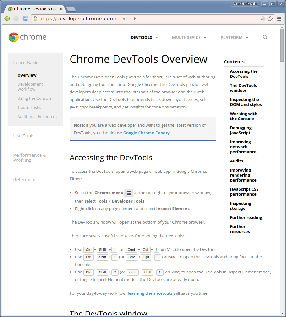
Orange on Gray!
Greyer and Greyer!

The Solarize Disease
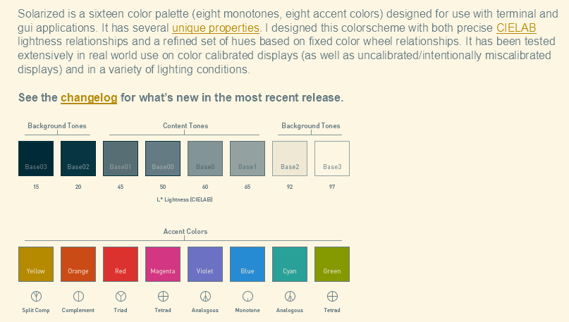
There's a website called Solarize, that focuses on desigining the most readable color theme. This is the disease that began the gray on white.
Witness:
Do you find the text easy to read?
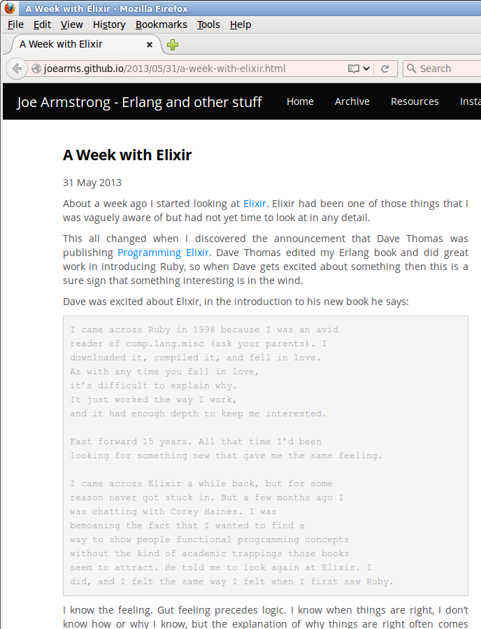
Things get worse:
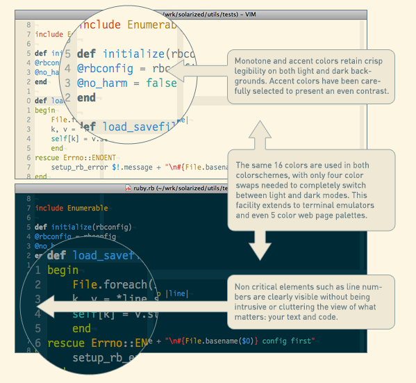
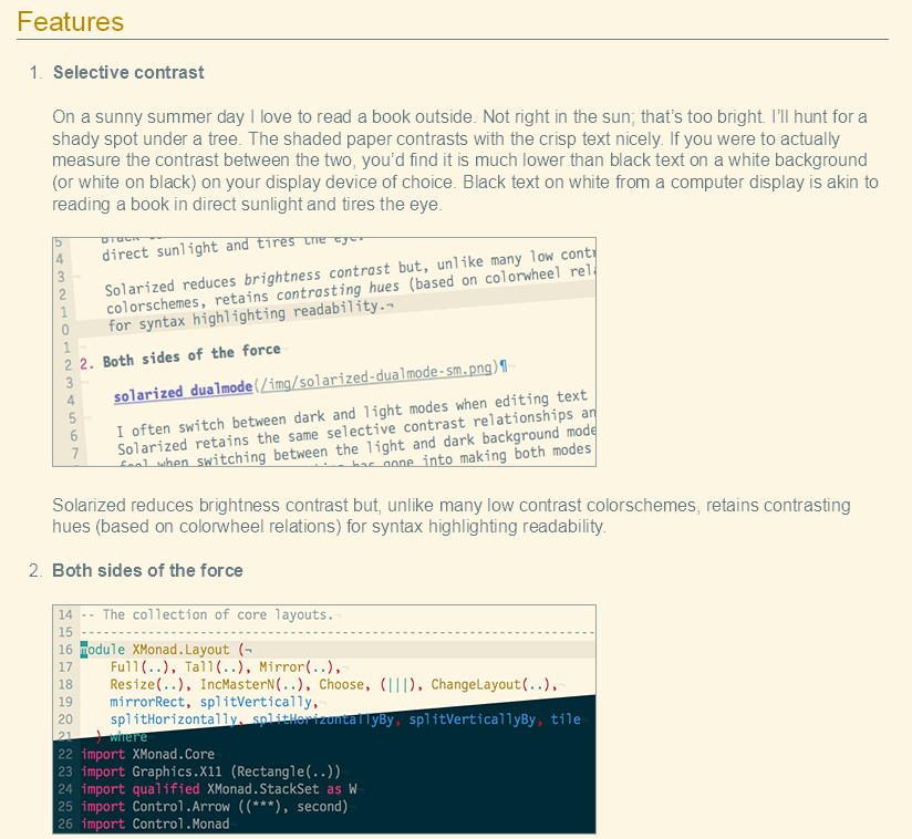
The Solarized color themes are low contrast, and supposedly works better when your computer display is under sunlight. Maybe so, but it looks terrible indoors.
see also:
- contrast rebellion
- By Zoltán Gócza, Richard Gazdik.
- http://contrastrebellion.com/