Web Design: Serif or Sans-Serif?
A survey of top web site's design choices, as of 2016-03-25.
Serif body text
The following sites use serif font for body text.
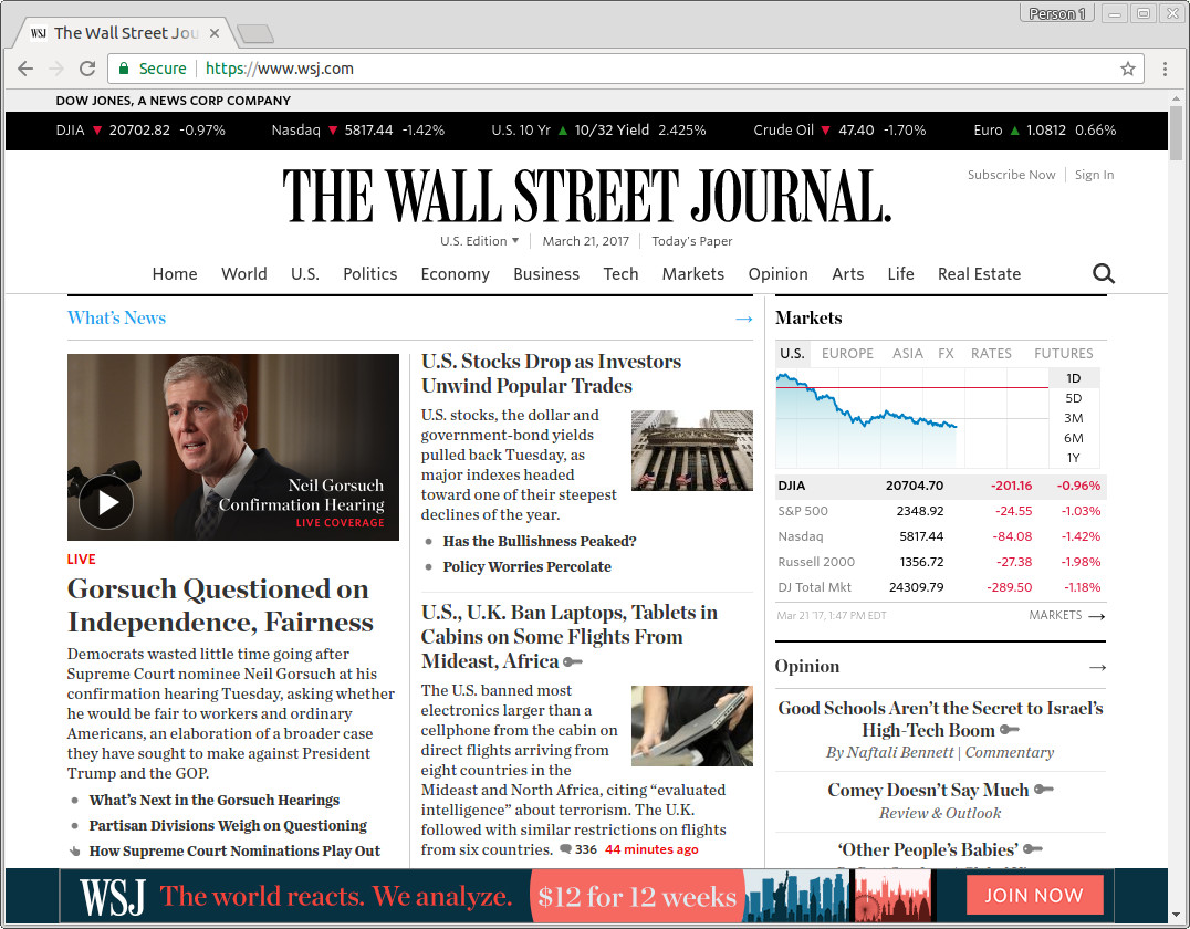
- Wall Street Journal https://www.wsj.com/
- New York Times https://www.nytimes.com/
- Washington Post https://www.washingtonpost.com/
- LA Times http://www.latimes.com/
- Time Mag http://time.com/
- Scientific American https://www.scientificamerican.com/
It's commonly thought that serif is more readable. However, if you do research, you'll find that scientific evidence are inconclusive.
sans-serif body text
Vast majority of websites are still sans-serif.
- USA TODAY http://www.usatoday.com/
- wikipedia [List of newspapers in the United States by circulation] ( https://en.wikipedia.org/wiki/List_of_newspapers_in_the_United_States_by_circulation )
- cosmopolitan mag. http://www.cosmopolitan.com/
- https://www.google.com/
- https://facebook.com
- https://youtube.com
- https://baidu.com
- https://yahoo.com
- https://amazon.com
- https://twitter.com
- https://ebay.com
- https://pinterest.com
- https://reddit.com
Title Text Font
- Wall Street Journal → serif
- New York Times → serif
- Washington Post → serif
- Los Angeles Times → serif
- USA TODAY → sans-serif
- Wikipedia → serif
Fixed Layout or Flow?
- Wall Street Journal → flow.
- Washington Post → flow.
- Los Angeles Times → flow.
- Wikipedia → flow.
- New York Times → fixed.
- USA TODAY → fixed.
the New York Times uses a fixed design. That is, if you change window size, and when your window width is smaller than 1000px, then, text will disappear, you'll need to scroll horizontally.
{Wall Street Journal, Washington Post, Los Angeles Times}, they are all “responsive design”. The layout reflows even when your window width is like a cell phone sized.
[see Web Design: Fixed-Layout vs Flowed-Layout (CSS)]
Text Logo Image or Text?
Some of the journals, use complex gothic font as their logos, like
𝕬 𝕭 𝕮
[see Unicode: Math Font ℤ]
so, do they design their own? or use Google Webfont, or use image, or SVG?
- Wall Street Journal → SVG
- New York Times → SVG
- Washington Post → SVG
- Los Angeles Times → SVG
- USA TODAY → text (probably because it's simple font)
- Wikipedia → PNG
so that means, SVG is now mature.
[see Practical SVG Tutorial]