CSS: Font based units: rem rcap rch rex ric
Font based units (relative unit)
Font based units changes with the font size user set in their browser or operating system.
For example, if user sets default font to 20px, then rem has value of 20px.
🟢 tip: often it's better to use rem unit instead of pixels.
On phone or laptop, many people have enlarged font, via system or browser.
If you design a box with rem, that size grows or shrink with user's font size.
But if you use pixels, it doesn't, so text overflows.
This is especially important for @media query.
Root element's font size: rem
rem-
Font size of Root Element.
by default is 16px. But its common for user to change it via operating system text scaling or in browser.
When used as value on
font-sizeproperty of the Root Element,remrefer to the property's initial value. (in browsers, it's16px)./* set rem length */ :root { font-size: 18px; }
Length unit based on root element's font size
rch-
Width of digit 0 of font size of Root Element. If writing direction is vertical, it is the height.
rex-
Height of lowercase letter x of font size of Root Element.
rcap-
Height of capital letters of the Root Element.
ric-
Height of Chinese character for water 水 of the Root Element.
Length unit based on current element's font size
em-
The length of
emis:emis equal to the computed value of thefont-sizeproperty of the element on which it is used. For example, if you saywidth: 50emon a paragraph, it means, 50 times the computed value offont-sizeproperty of the paragraph.- If
emoccurs in the value of thefont-sizeproperty itself, it refers to the computed value offont-sizeof the parent element. - If used on the Root Element,
1emequals to thefont-sizeproperty's initial value (which is16px).
🛑 warning: Values compound when nested. Meaning, in nested element, if they all have
font-sizeset toemunit, they grow on each other. It's better to always usereminstead.Example
font size of 1.2em nested 5 times, became almost 40px.
abc.x1e1fc { font-size: 1.2em; } <div class="x1e1fc"> <div class="x1e1fc"> <div class="x1e1fc"> <div class="x1e1fc"> <div class="x1e1fc"> abc </div> </div> </div> </div> </div> ch-
Width of digit 0 of current font. If writing direction is vertical, it is the height.
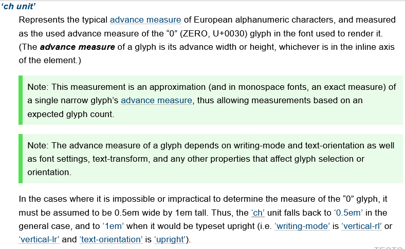
CSS Values and Units Module Level 4 Editor's Draft, 12 October 2022. https://w3c.github.io/csswg-drafts/css-values/#ch ex-
Height of lowercase letter x of current font.
exis equal to current font's “x-height”, usually the height of the letter x. Typically about half ofem, depending on current font.Like
em, the length of1exdepends on parent'sfont-size. cap-
Height of capital letters of the current element's font.
ic-
Height of Chinese character for water 水 of the current element.