CSS: Length Units
Pixel Unit
px-
Pixel. Practically, 1/16 of default font size of a device.
Font Based Units (relative unit)
Font based units respect the default font size user set in their browser.
(px does not.)
Therefore, if you want to set font size, best to set it using rem.
If you use px, then user's font size are ignored.
root font based
rem-
Font size of Root Element.
by default is 16px.
/* changing rem length */ :root { font-size: 50px; } rch-
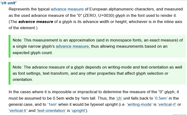
Width of digit 0 of font size of Root Element. If writing direction is vertical, it is the height.
rex-
Height of lowercase letter x of font size of Root Element.
rcap-
Height of capital letters of the Root Element.
ric-
Height of Chinese character for water 水 of the Root Element.
element font based
em-
Font size of parent element.
🛑 WARNING: Values compound when nested, if you set
font-sizeto this. Meaning, in nested element, if they all havefont-sizeset toemunit, they grow on each other. ch-
Width of digit 0 of current font. If writing direction is vertical, it is the height.
ex-
Height of lowercase letter x of current font.
cap-
Height of capital letters of the current element's font.
ic-
Height of Chinese character for water 水 of the current element.
Relative Units
rlh-
Line height of the Root Element.
lh-
The computed value of the line-height property of the element on which it is used.
🛑 WARNING: the size of actual line height may differ based on their content, e.g. contain words with large font size.
vw-
1% of the view port width.
vh-
1% of the view port height.
vmin-
Smaller of
vworvh vmax-
Larger of
vworvh
%-
Percent. Relative to parent element. Exact meaning depends on the element it is used.
Physical Units
cm-
Centimeter.
mm-
Millimeter.
in-
Inch.
pt-
1/72 of a inch.
pc-
1/6 of a inch.
Which unit to use
I recommend:
rem→ for font size and margin, padding, box round corner.vw,vh,vmin,vmax→ for layout control.px→ for border line, etc.
Do not use
- percent
%, because the meaning depends on the HTML element.
Example: CSS Length Unit
div {margin:1rem}
🛑 WARNING: There must be no space before the CSS unit, and a unit is required, except when the value is 0, else it's syntax error.
rem, Root Font Size
The length of rem is:
The
computed value
of font-size of the
Root Element
.
When used as value on font-size property of the
Root Element,
rem refer to the property's initial value. (in browsers, it's 16px).
em
The length of em is:
emis equal to the computed value of thefont-sizeproperty of the element on which it is used. For example, if you saymax-width:50emon a paragraph, it means, 50 times the computed value offont-sizeproperty of the paragraph.- If
emoccurs in the value of thefont-sizeproperty itself, it refers to the computed value offont-sizeof the parent element. - If used on the Root Element,
1emequals to thefont-sizeproperty's initial value (which is16px).
ex, x-height
ex is equal to current font's “x-height”, usually the height of the letter x. Typically about half of em, depending on current font.
Like em, the length of 1ex depends on parent's font-size.
ch
ch is equal to the box width of the digit 0 (ZERO) character of the current font. It is about the same as half of em.
vw, vh, vmin, vmax
vw-
Equal to 1% of the initial containing block (the view port). It does NOT include the scrollbar width. When browser window changes size,
vwalso changes.🟢 TIP: One great use of
vwis to specify height as a percentage of width. You can't do this with percentage. [see CSS: Fixed Aspect Ratio] In fact, it's useful to replace almost all CSS: Percentage Value byvw, because the meaning of percentage is different for each CSS property. vh-
Equal to 1% of the height of the initial containing block.
vmin-
Equal to the smaller of vw or vh.
vmax-
Equal to the larger of vw or vh.
cm, mm, in, pc, pt
cm-
centimeter. 10 mm → ~0.3937 inch; ~37.795 px
Physical units such as
cmis useful for specifying printed style. For example:@media print { table {font-size: 4cm} } mm-
millimeter. 0.1 cm → ~3.78 px
in-
Inch. 6 pc. 72 pt. 96 px. → 2.54 cm
pc-
1/6 inch. 12 pt. 16 px. “pc” stands for “pica”. → ~0.423 cm
pt-
1/72 inch. (~0.0138 inch) ~1.33 px. “pt” stands for “point”. → 0.3527 mm
What is CSS's Default Unit?
- There is no default unit. Omitting unit is syntax error.
- You can omit unit only when the value is 0.