CSS: Percentage value
Percentage Value
% is percentage.
Example:
div {width: 5%}
Percentage is not technically considered a “length unit”.
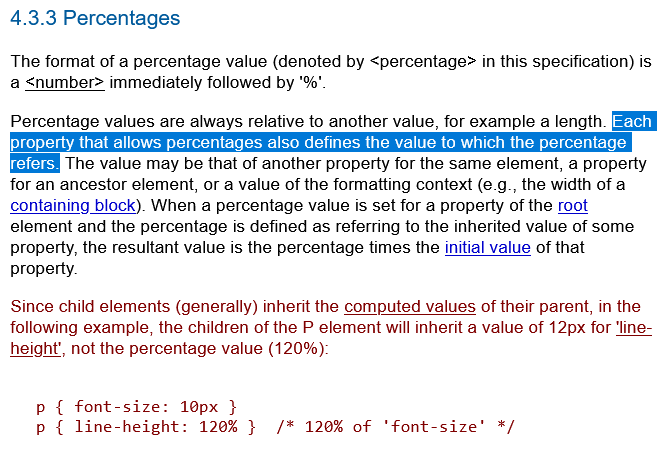
Meaning of percent value is dependent on the specific property it is used on.
when is good to use percentage for length
in css, when is good to use percentage for length
(ai answer)
Use percentage lengths in CSS when you want an element’s size (or spacing) to be a proportion of its containing block / parent, especially for fluid and responsive layouts.
Best times to use %
-
Fluid / responsive widths
- Making columns, cards, images, or containers take a share of the parent’s width.
- Example:
width: 50%,width: 33.333%, orwidth: 100%so the element always fills or divides the available space as the parent resizes.
-
Proportional sizing relative to a container
- Nested components that should scale with their parent (sidebars, media objects, grid tracks that are percentage-based, etc.).
- Useful inside flex or grid items when you want “take X% of the free space” behavior without hard-coding pixels.
-
Padding and margin that scale with width
- Horizontal padding/margin percentages are calculated against the width of the containing block.
- This is handy for consistent side spacing that grows/shrinks with the layout (common in fluid designs).
-
Height when the parent has an explicit height
height: 100%(or any %) works reliably only if the parent’s height is defined (notauto).- Classic use: making a child fill a fixed-height or viewport-height parent (
html, body { height: 100%; }then children can use%).
-
Positioning offsets
top/left/right/bottompercentages (relative to the containing block) for percentage-based placement of absolutely or relatively positioned elements.
-
Font-size inheritance chains (less common today)
font-size: 80%or120%relative to the parent’s computed font size—useful for scalable typography, thoughrem/emare usually preferred now.
When percentages are less ideal
- Precise, fixed UI chrome (icons, thin borders, small fixed controls) → prefer
pxorrem. - Heights of auto-sized parents →
%often collapses toautobecause the percentage has nothing concrete to resolve against. - Vertical margins/paddings → still resolved against the width, which can feel unintuitive.
- Very complex nested percentage chains → can become hard to reason about; modern alternatives (
frunits in Grid,flex-grow,clamp(),min()/max(), container queries, or viewport units) are often cleaner.
Quick practical guidelines
| Goal | Prefer %? |
Better alternatives today |
|---|---|---|
| Fluid column / card width | Yes | fr, flex, container queries |
| Full-bleed child | Yes (100%) |
100% or stretch |
| Proportional padding that scales | Sometimes | clamp(), logical properties |
| Fill known parent height | Yes | 100% or dvh/svh |
| Typography scaling | Rarely | rem / em |
| Borders, shadows, thin lines | No | px / rem |
Rule of thumb: Reach for % when the size should be relative to the parent’s size and you want the layout to remain fluid. Prefer modern relative units (rem, em, vh/dvh, fr, cqw, etc.) or CSS functions when you need more predictable or viewport/container-aware behavior.