CSS: Responsive Table
Problem: Table on Small Screen
You want a HTML: Table that can be displayed on a small screen e.g. mobile phone.
(The technique is called “responsive table”)
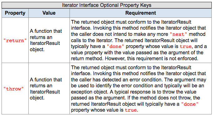
Here is how a table looks on laptop screen.

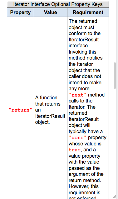
On a small screen, it looks like this:

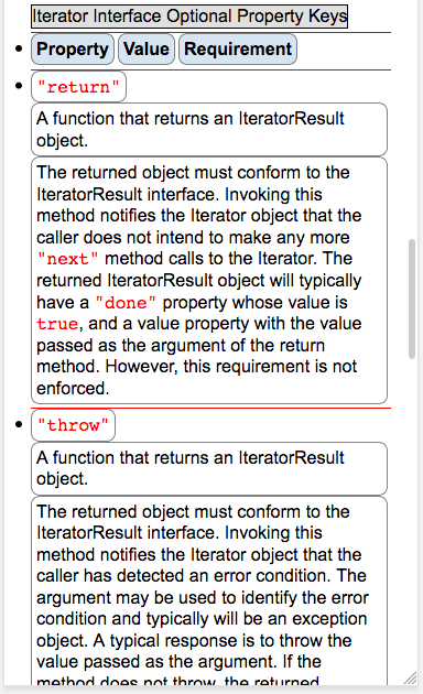
With CSS, you can make it to look like this:

Sample Table Code
Here is a sample HTML table to play with.
| Dec | Oct | Hex | Char | Comment |
|---|---|---|---|---|
| 65 | 101 | 41 | A | Something something long text here. Too long and is a problem when displaying on a small screen. And it is really long, so long that on small narrow width screen one column becomes long strip while other columns are empty space, and page becomes very long, requiring lots scroll. |
| 66 | 102 | 42 | B | Something something long text here. Too long and is a problem when displaying on a small screen. And it is really long, so long that on small narrow width screen one column becomes long strip while other columns are empty space, and page becomes very long, requiring lots scroll. |
Code
<table class="nrm">
 <tr>
  <th>Dec</th>
  <th>Oct</th>
  <th>Hex</th>
  <th>Char</th>
  <th>Comment</th>
 </tr>
 <tr>
  <td>65</td>
  <td>101</td>
  <td>41</td>
  <td>A</td>
  <td>Something something long text here. Too long and is a problem when displaying on a small screen. And it is really long, so long that on small narrow width screen one column becomes long strip while other columns are empty space, and page becomes very long, requiring lots scroll.</td>
 </tr>
 <tr>
  <td>66</td>
  <td>102</td>
  <td>42</td>
  <td>B</td>
  <td>Something something long text here. Too long and is a problem when displaying on a small screen. And it is really long, so long that on small narrow width screen one column becomes long strip while other columns are empty space, and page becomes very long, requiring lots scroll.</td>
 </tr>
</table>
table {
 border-collapse: collapse;
 margin: 1rem;
}
table th, table td {
 padding: 0.25rem;
 border: solid thin gray;
}
table th {
 background-color: #d7e4f2;
}
Solution, CSS Responsive Table
Here is the CSS to change the look of table on small screen.
@media all and (max-width: 760px) {
 table {
  display: block;
 }

 table caption {
  display: inline-block;
 }

 table tr {
  display: list-item;
  border: none;
  border-top: solid thin red;
 }

 table th {
  display: inline-block;
  border: solid thin gray;
  margin-right: 0.2rem;
 }

 table td {
  display: inline-block;
  border: solid thin gray;
  margin-right: 0.2rem;
 }
}
CSS, misc, advanced
- CSS: Case Sensitivity
- CSS: Declare Charset
- CSS: Comment Syntax
- CSS: Default Unit
- CSS: Computed Style
- CSS: Pseudo Element
- CSS: Pseudo Class
- CSS: Specificity
- CSS: Data URI Scheme
- HTML: Protocol-Relative URL
- CSS: Browser Default Style Sheet (2025-12)