Mathematica Logo History

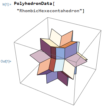
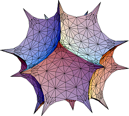
Here is a history of Mathematica logos thru its versions. All these are designed by Michael Trott.
Version 1 (1988)

Version 2 (1991)

Version 3 (1996)
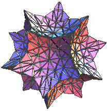
Version 4 (1999)
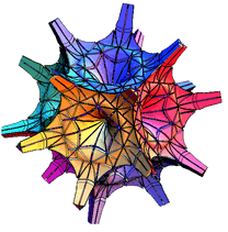

Version 5 (2003)
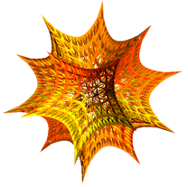
Version 6 (2007)

Version 7 (2008)

Version 8 (2010)


Version 13 (2021)
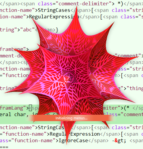
Version 14 (2022)


Misc Notes
- My favorite is version 2 logo, Second favorite is version 3, then version 1 — the plain stellated icosahedron.
- The ones i like the least is version 7's logo, and 6's logo.
- They lost much of the math's beauty of simplicity and structure.
- In particular, if you look them them closely, they have artifacts of some flower-like arcs inside, and also the gradient coloring.
- They are caused in part by the complex gaps of the surface patches, possibilty also caused by partial transparency of the surface.
Reference
- the story of spikey
- By Stephen Wolfram.
- https://blog.stephenwolfram.com/2018/12/the-story-of-spikey/
- Mathematica Quick Revision History @ http://www.wolfram.com/mathematica/quick-revision-history.html
- Making the Mathematica 6 Spikey
- By Michael Trott.
- http://blog.wolfram.com/2007/05/22/making-the-mathematica-6-spikey/
- The Cover Image: Making the Mathematica 6 Surface-Textured Hyperbolic Dodecahedron By Michael Trott. @ http://library.wolfram.com/infocenter/MathSource/6712/