Xah Web Dev Blog Archive 2018-12
npm Fiasco. Malware that Steals Bitcoin (2018) added to History of Web Tech. Index.
Google Censorship on Trump and Hillary Clinton (2018)
Started to collect Google's evil deeds there.
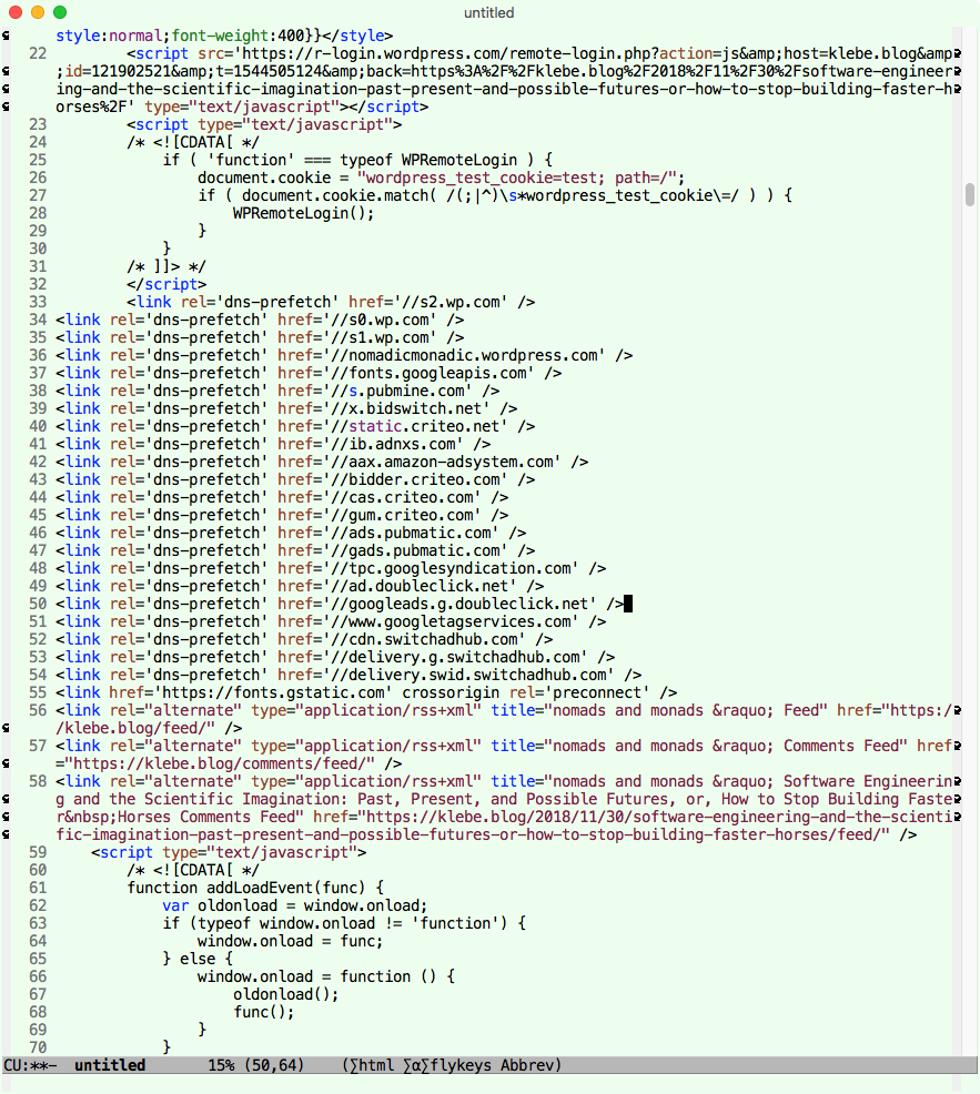
“modern” template driven html. prefetch all the ads in the world
HTML: Audio Tag. updated.
Mac still doesn't support webm video nor opus audio
new page. a simple, frequently asked example.
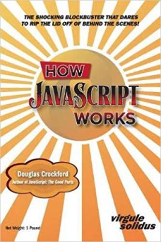
Douglas Crockford has a new book How JavaScript Works I thumbed thru in a friend's house. It's very good. It's unusual. It's not for beginners. And written in a stye you have to read from cover to cover in sequence. But you get deep understanding.
JavaScript SVG Clock
SVG Clock updated code.
it's so convenient to use bleeding edge tech.
.insertAdjacentElement
[see JS DOM: insert Adjacent Element]
and
.currentScript
[see JS DOM: Get Current Script Element]
no more inserting an id and get element by id.
Web Design: Fixed-Layout, Flowed-Layout, Responsive Design
Note that in 2000s, there is big brouhaha among “web design” circles about Fixed-Layout vs Flowed-Layout. Most sites is fixed layout. best example is Apple. They assume ur screen is ≥ 1000 pixels wide. Fixed layout is like printed magazine. if ur window is smaller, u can only see parts.
see CSS: Fixed-Layout vs Flowed-Layout
here's minimal window width assumptions of apple facebook google microsoft amazon etc sites around 2010 see Web Design, Minimal Window Width
the debate about fixed vs flowed layout is that, fixed is always better looking on a specific screen. But flowed looks much better on a screen not the designer intended/expected.
I prefer flowed, and thought about it for years. Flow layout is supposed to work in any screen size and ratio. In practice, its just impossible. What actually happens, as with today's “responsive design”, is just design for four or so intended screen size and ratio.
note that, web design began in ~1994 when html began. Around that time, most monitor is 640x480. around ~2005 it's 800px width. 2010 it's 1020 width (by now, laptops is most common). most professional web sites use fixed layout. i.e. design for specific screen width.
also, flowed layout is pretty much favored by nerds or programers, who focus on logical structure. example: chapters, sections, subsections. Fixed layout design, is favored by artists or “designers” (aka desktop publishing of 1990s on Mac), because it's pretty.
note, CSS was invented in 1996 but isn't used widely till ~2002. The thinking about flowed vs fixed layout was that, always markup by logical structure, but use css to make the design/layout. this is actually a myth to this day.
Other than academic papers, vast majority of commercial sites do not have any natural logical structure. The “logical” markup is just a artificial pretense. This can be seen today especially with so-called “single page app”. #css #design
CSS: Responsive Table (major update)
discovered CSS unit “cap”
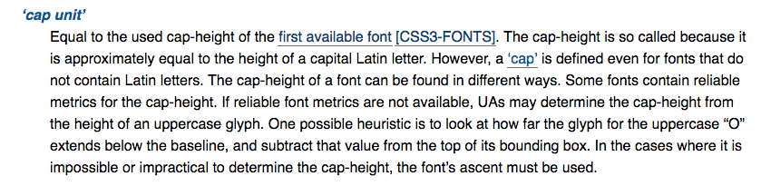
discovered CSS unit cap. i thought it'd solve the font size problem. But very disappointed. It's a CSS length value. Not a property. We need a property, e.g. font-cap-size:16px.
CSS: Length Units (more major update.)
CSS unit is incredibly complex.
HTML: the Root Element (new)
“Alien heads found in Georgia”. 'was the origin of name of the font Georgia.
CSS: font-family
CSS for beginners. Filling up my CSS tutorial so it covers all commonly used properties. Now, the font topic is complete
updated
Font Size Problem: CSS Size vs Visual Size (2018) (on its own page)
all updated or rewritten
CSS: common web fonts (updated. added JavaScript to show what font your browser is actually using.)
2018-11-02 Turns out, it is impossible to find out programatically what font is actually used.
JS: DOM Methods (minor update)
jQuery Tutorial (minor update)
updated.
HTML Tutorial Complete update.
obsolete html5 tags
these html5 tags are now obsolete
<command /><keygen /><menuitem />
and <hgroup>
, w3c says no, whatwg says it's good.
updated HTML: Tags
HTML: List of Self-Closing Tags updated
HTML: Tags (minor update. convert table to list. easier for phone screen)
added the case for css.
CSS Selector Syntax (rewrite)