CSS: Example. 3-Column Side-Panel Layout (using margin)
Here is how to create a 3-columns layout using CSS.
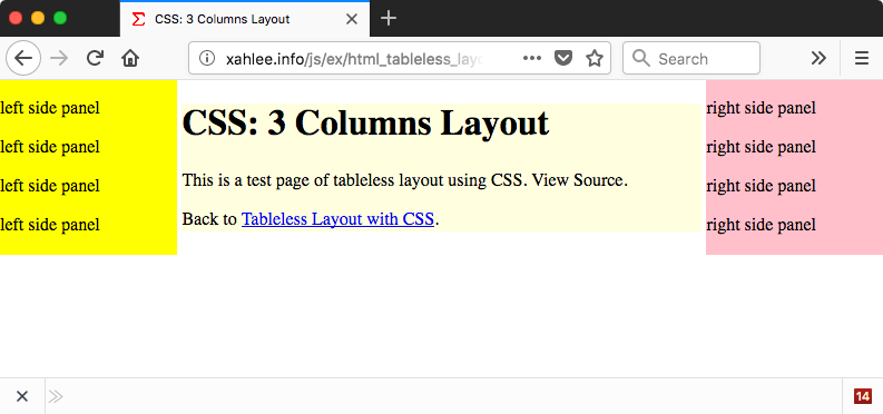
Margin can be used to create several columns or panes.
Code
<body>
<div id="xpanel-mid">…</div>
<div id="xpanel-left">…</div>
<div id="xpanel-right">…</div>
</body>
#xpanel-mid {
margin-left: 20vw;
margin-right: 20vw;
background-color: lightyellow;
}

#xpanel-left {
width: 20vw;
position: absolute;
top: 0;
left: 0;
background-color: yellow;
}

#xpanel-right {
width: 20vw;
position: absolute;
top: 0;
right: 0;
background-color: pink;
}
Create 3 div elements, and set each's width.
For the middle panel, set margin-left and margin-right. This will fix it into a narrow central column.
For the left panel, specify a width that is the same as the middle's margin-left. This will fix the panel on the left side with a fixed width. Similar for the right pane.
The
position: absolute
is optional. It makes it into its layer.
[see CSS: Position Absolute]
You should also add padding. [see CSS Margin vs Padding]
Any text that is not in one of the left/middle/right containers will be left on the bottom.